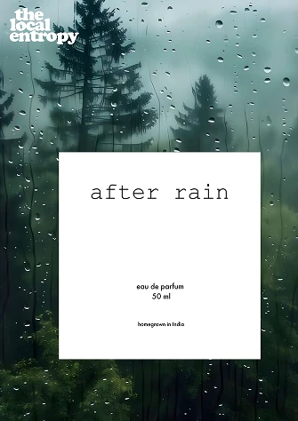
The Local Entropy
A brand identity for a conceptual Indian fragrance house · Visual design and typography · IIT Delhi
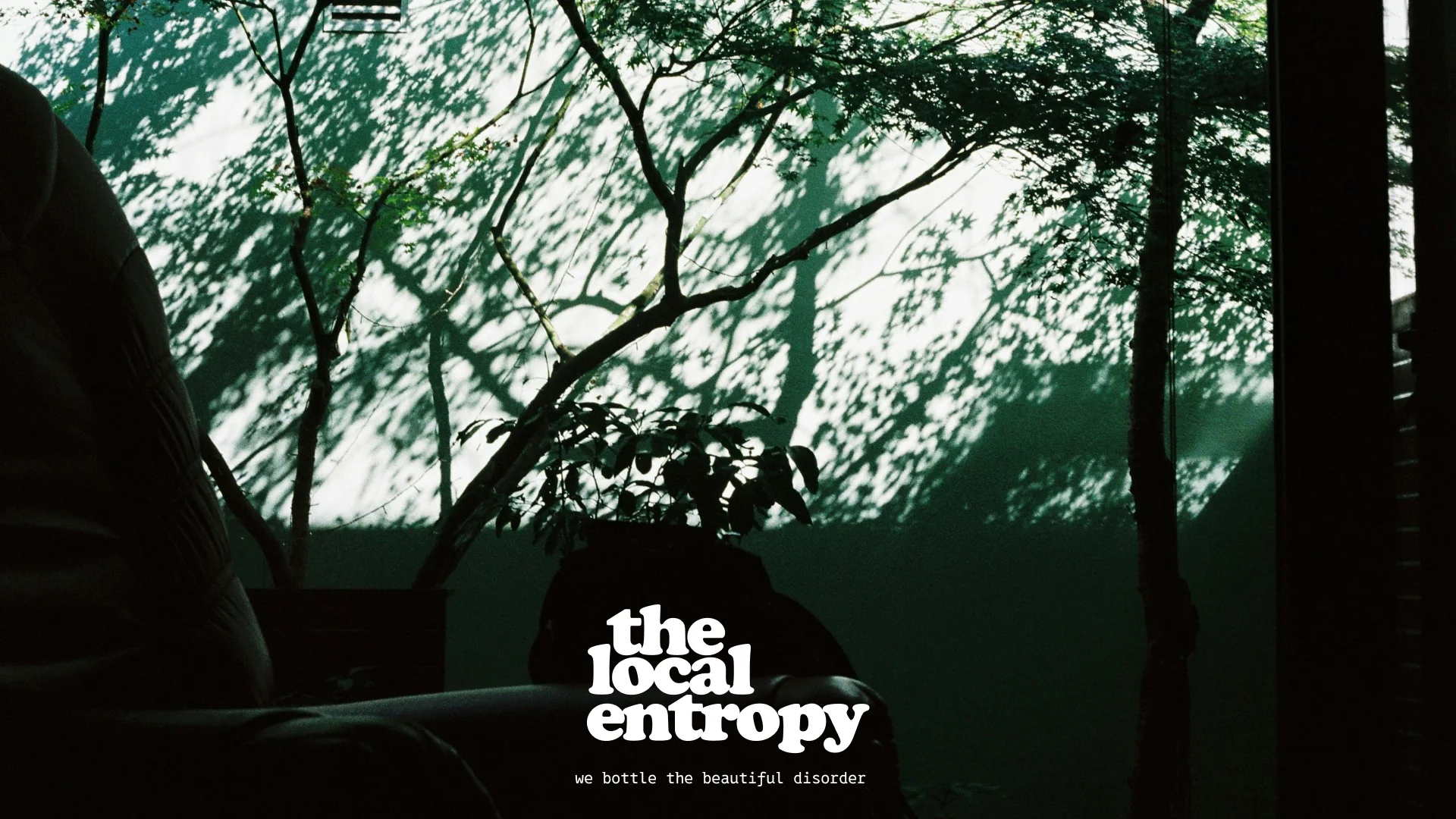
We bottle the beautiful disorder.
The Local Entropy is a fragrance brand aimed at a generation that no longer wants its chaos smoothed away. Rather than selling calm by erasing the city, it bottles the atmosphere of the Indian monsoon, both the rain and the strange, surreal stillness that follows it.

The insight
Young Indians in metros are overinformed and overanxious, constantly navigating the chaos of traffic, inflation and digital noise.
They are not looking to escape that chaos. They want a brand that validates it as beautiful, one that grounds them without selling a polished perfection they know does not exist.
The Anxious Aspirationalist
A growing segment of young urban Indians who are successful but overwhelmed, and who seek brands that offer both escape and a sense of grounding. This persona is the target the brand is built around.
22 to 35years old
Digital nativediscovers brands on the explore page
Tier one metrosthe chaos of the big city
Disposable incomespends on the self as a treat

Treat culture
With rising stress and more time spent alone, small purchases function as a form of self reward. The audience favours brands that signal creativity and intellect within their social circles.
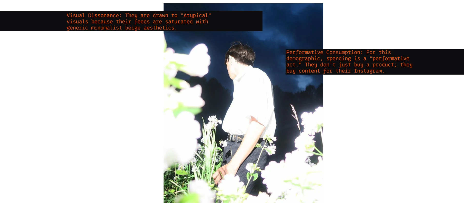
Why atypical works
Their feeds are saturated with generic, minimalist beige, and they are tired of lazy fusion. They are drawn to the atypical, because for this demographic spending is performative. They do not only buy a product, they buy content.
A name, made of disorder
The name borrows a scientific term, entropy, the measure of disorder, and places it in a category that never uses it.
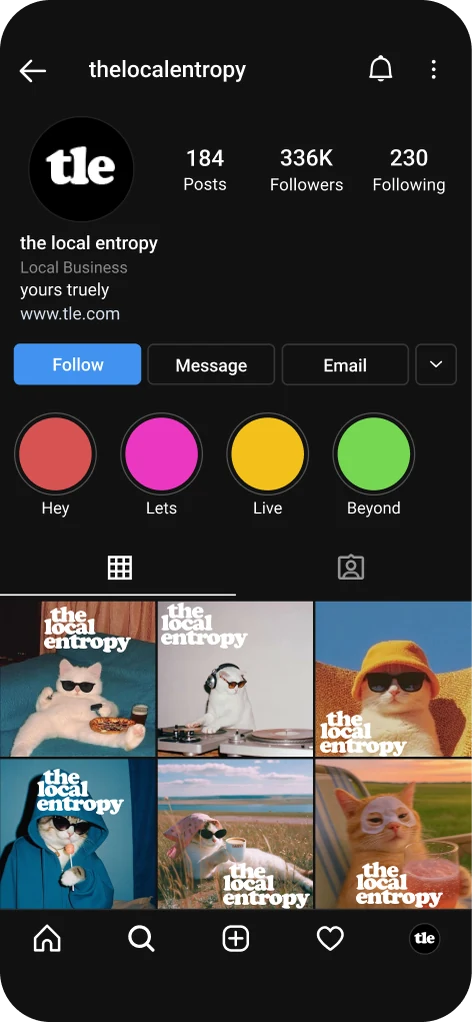
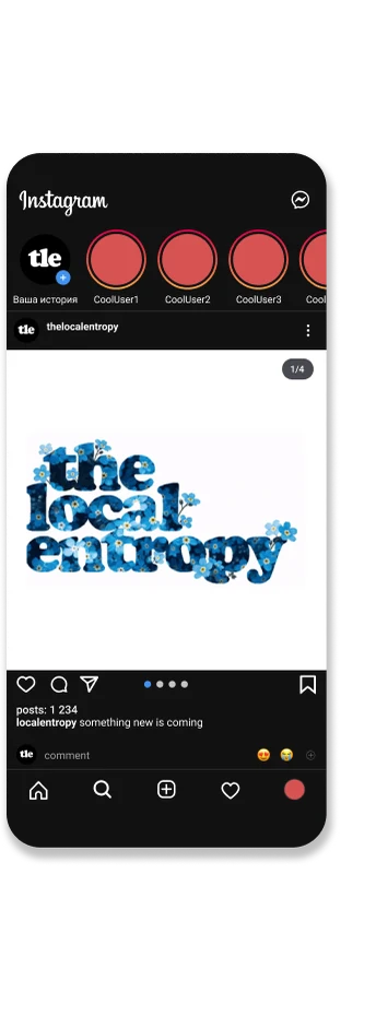
The wordmark is set in Cooper Black, stacked and deliberately off kilter, so the logo itself performs the disorder it describes.
Compressed to a single syllable, tle, the mark still reads. It scales from a full, sprawling lockup down to a profile photo without losing legibility.
Finding the white space
The Indian fragrance market is polarised. Global houses are serious and focused on form, while local incumbents feel conventional. Neither addresses the young urban Indian who wants authenticity without tradition and luxury without boredom.
 global, premium, serious about form
the local entropy
Logo as content
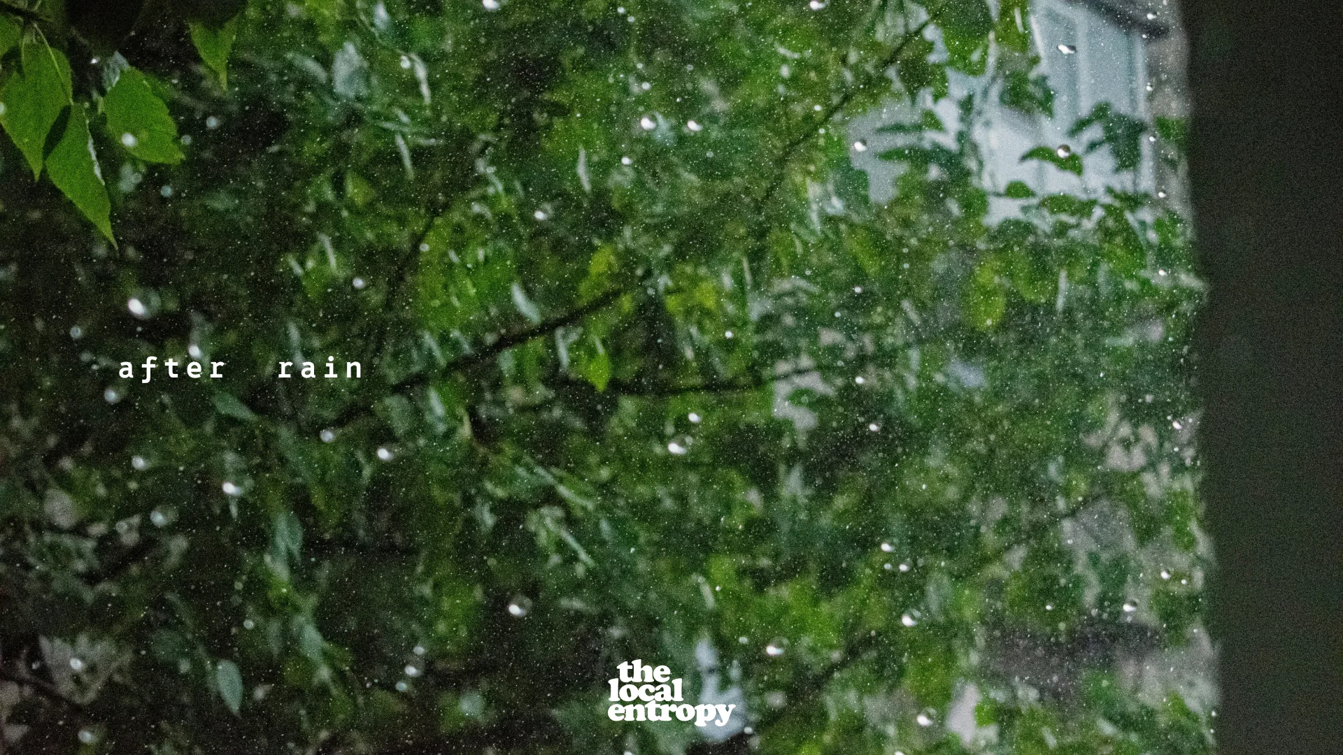
Set against unexpected backdrops such as flowers, weeds, rain or a shadow on a wall, the heavy retro wordmark stops reading as a logo and starts reading as content. It draws attention and invites commentary. The mark adapts to each setting, so it stays current.
The surreal factor
Imagery that blends real local elements such as rain and flora with a surreal treatment of intense colour and impossible layering reads as artistic and escapist. The brand film sets the liquid chrome wordmark adrift inside it.
A brand led by social media
There is no physical store, so the feed serves as the storefront. Each touchpoint is composed to be easy to capture and share, a curated presence built for a digitally native audience.
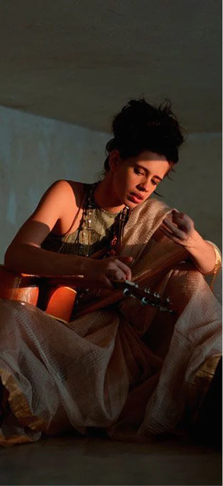
Kalki Koechlin as the face. She works against the conventional Bollywood mould, choosing unconventional roles and a distinctly intellectual voice. Local, atypical, and someone the audience already follows.

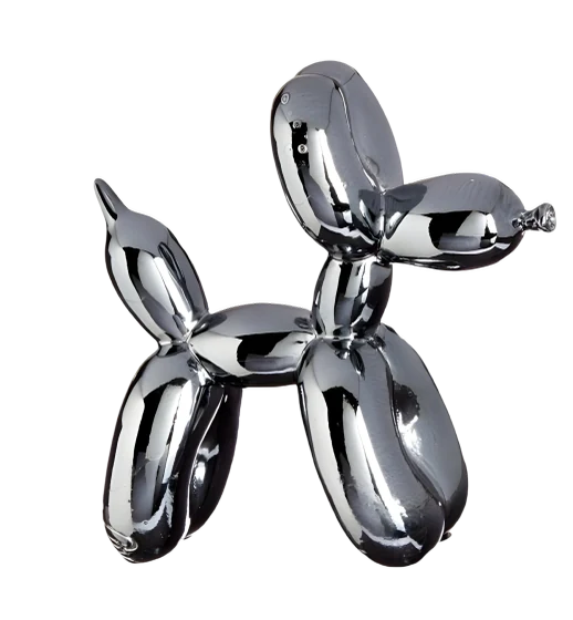
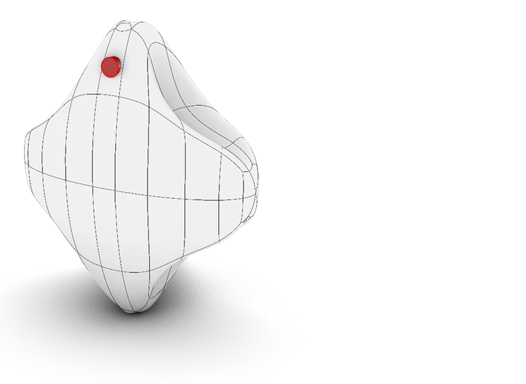
The object
The bottle is not a bottle. The brand renders its world in liquid chrome, as an ornament, a flower or a balloon dog, generated as digital objects and refined into form. Each one is made to be kept and displayed long after the scent is gone.


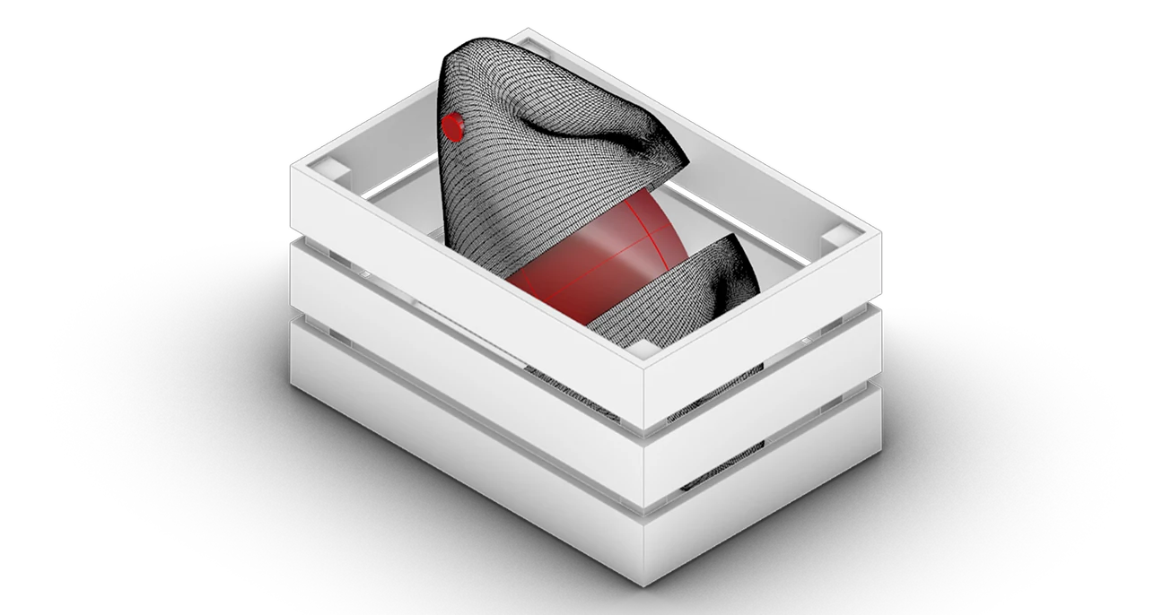
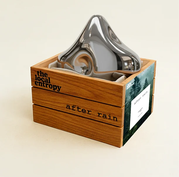
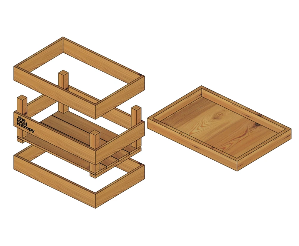
The Mango Crate
The packaging is treated as part of the experience. The mango crate is a playful and recognisably local object. Since there is no store, the unboxing takes the place of one, so the crate is designed to be filmed, saved and displayed.
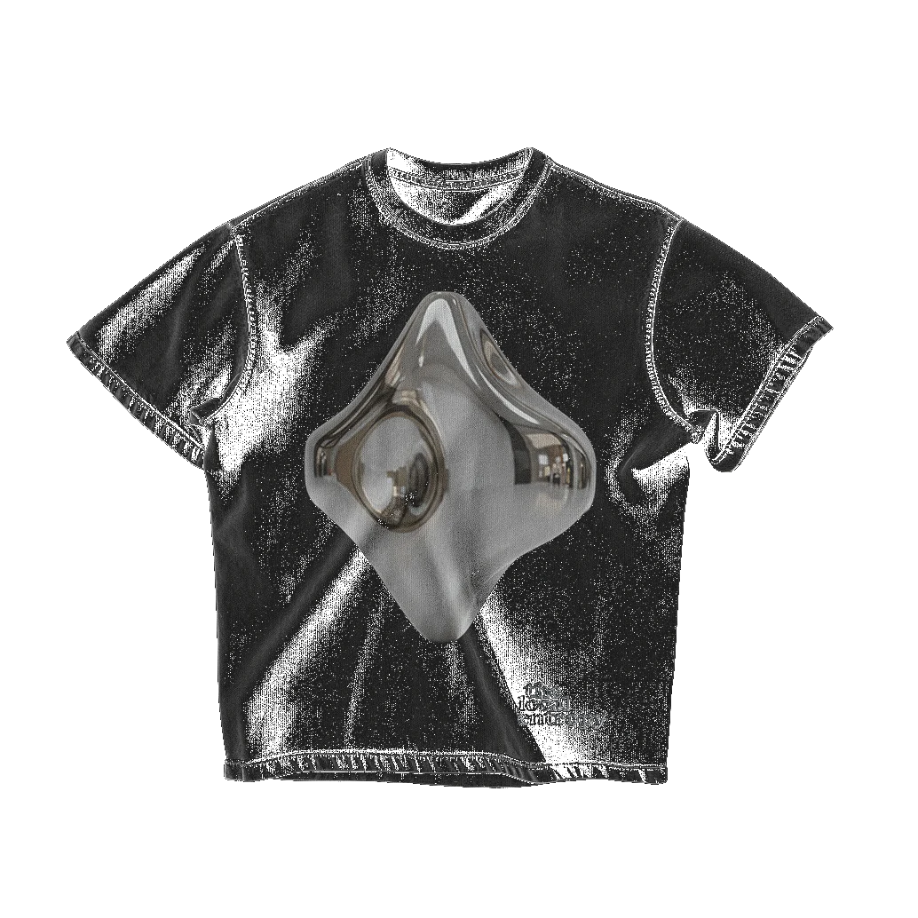
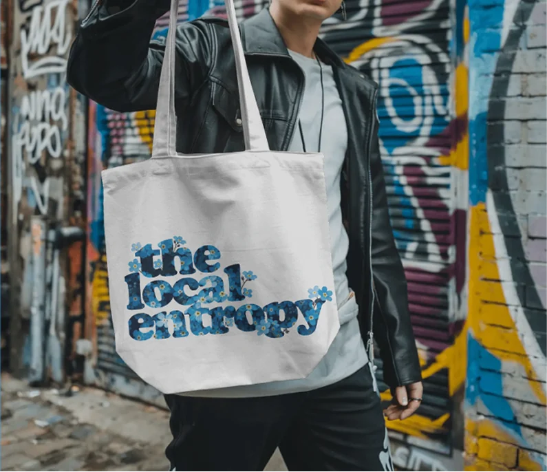
Wearable content
The aim is not to sell merchandise but to create an insider club. The apparel acts as a physical token that marks the wearer as part of the brand's conceptual world.